

WESTWORLD – TYPEFACE DESIGN
In addition to the keyvisuals and ads for the Westworld Alexa game, The Maze, I also had the opportunity to work on some of the in-game visual assets. For those pieces we wanted to create something that felt in-world of the park, and thus a bit separate from the ad materials for the game.
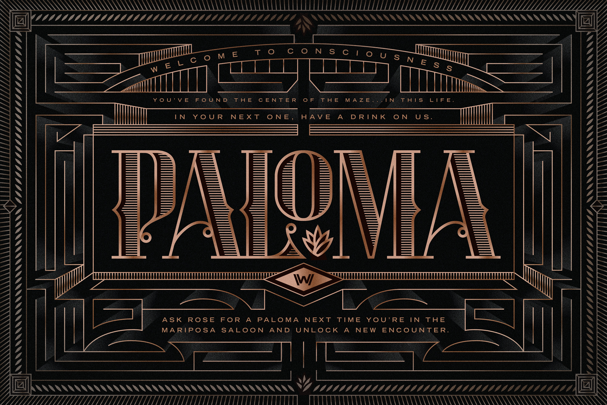
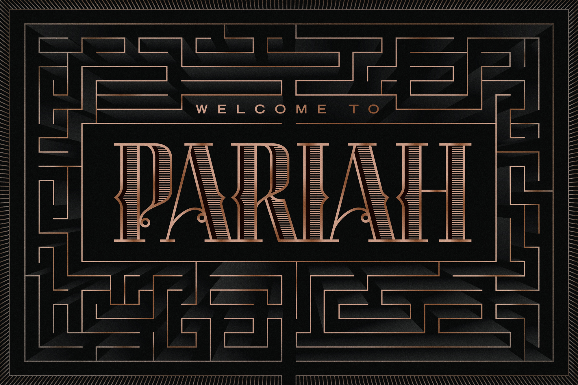
To that end, I created this typeface to be used in titles, location identifiers, win cards, etc. The type itself is inspired by typography of the 1800s old-west frontier, complete with median spurs, contextual alternates, shading, and dimensional details. Because Westworld is a premium experience we also wanted to imbue the type with a bit of that feeling, hence the gold foil-like texturing. In each of the cards, the headline is set in the center surrounded by an intricate and decorative maze structure, as a nod to the content of the game.
• • •
Client: HBO
Role: Type Design, Illustration
Chief Creative Officer: Menno Kluin
Executive Creative Directors: Sam Shepherd, Frank Cartagena
Creative Directors: Doug Murray, Andrew Hunter
Design Director: Brian Gartside
• • •